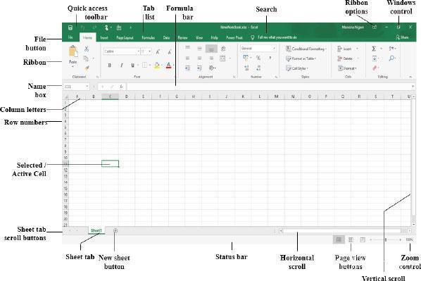
Overview of the Power BI interface
Brief intro to different visualization types and their use cases
What are Cards?
Single-value visualization showing key metrics or KPIs.When to Use Cards
Highlighting important metrics like total sales, count of customers, or average profit.
Creating a Card in Power BI
Dragging fields to the Card visualization
Formatting options (font size, color, border, background)
Showing comparison (e.g., this month vs. last month) using KPI cards.
Pie Chart
Purpose and Use Cases of Pie Charts
Showing percentage breakdowns for categorical data.
Creating a Pie Chart in Power BI
Selecting categorical and value fields (e.g., Sales by Product Category)
Customization Options
Formatting labels and data colors
Legends, tooltip configuration, and data label adjustments
Limitations of Pie Charts
Discuss when not to use pie charts (e.g., when data has too many categories).
Stacked Bar Chart
Introduction to Stacked Bar Charts
Showing parts of a whole across categories, suitable for time series or grouped data.
Creating a Stacked Bar Chart
Dragging categorical data (e.g., regions) and numerical data (e.g., sales) into the chart
Formatting the Stacked Bar Chart
Adjusting colors, axis labels, tooltips, and legends
Adding data labels and working with totals
Choosing Between Stacked and Clustered Bar Charts
Explanation of each type and its ideal scenarios
Hands-On Practice
Practice exercises creating each visualization
Discussion on interpreting and combining these charts in reports
Q&A and Common Issues
Troubleshooting tips
Q&A session to address specific student questions


